


From Raw Data to Decisions: Beyond a Power BI Course | NIIT
FROM RAW DATA TO DECISIONS: BEYOND A REGULAR POWER BI COURSE
Data is now part of almost every business decision, from understanding customer behaviour to tracking sales and improving operations. But collecting data is only the beginning. A course data science approach helps learners understand how data can be cleaned, analysed, visualised, and used to support decisions. Tools such as Excel, Power BI, and Tableau can help turn large amounts of information into clear and useful business insights.
Why Businesses Need More Than Raw Data
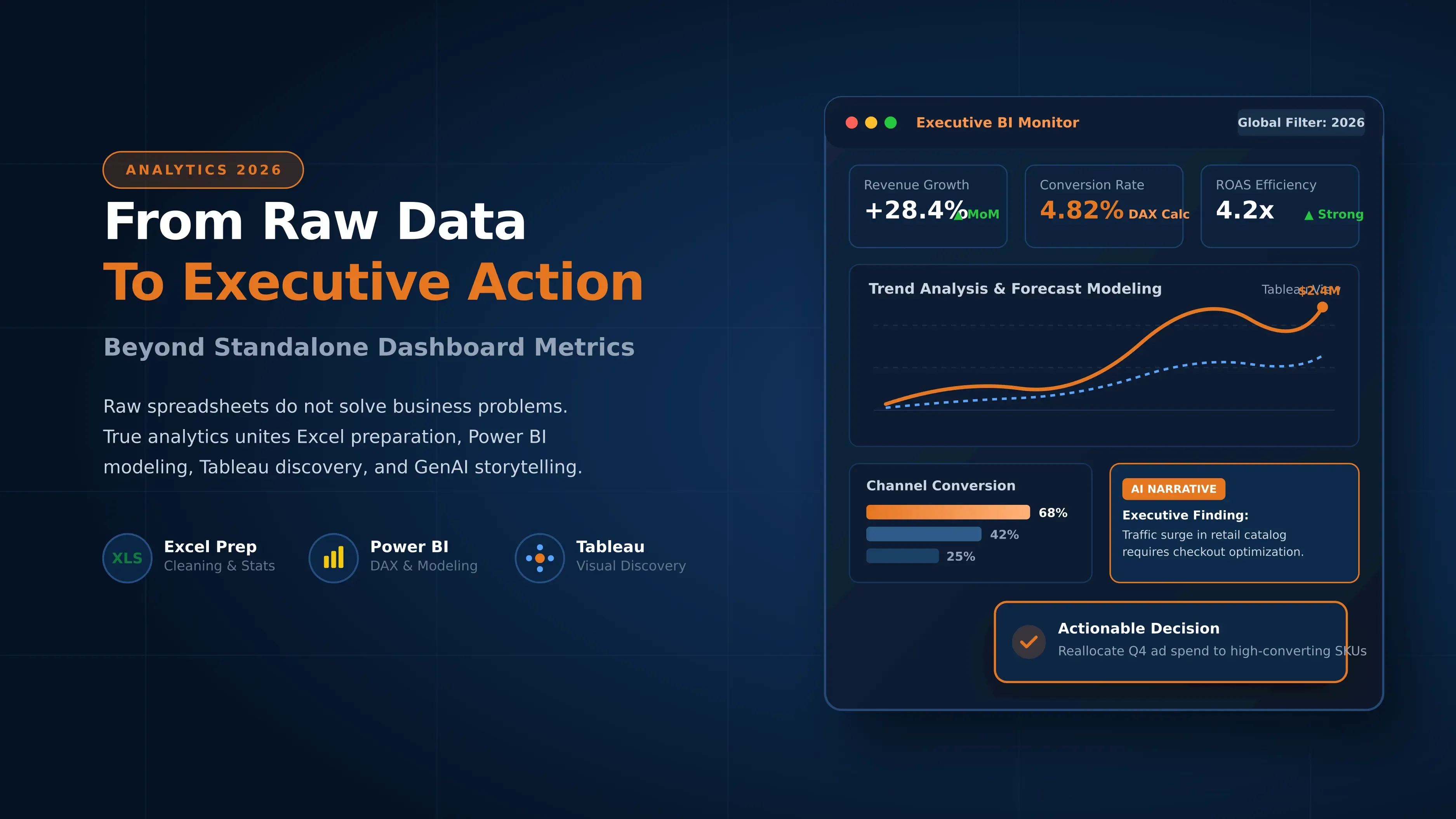
Businesses collect data from websites, applications, sales systems, customer databases, social media, and many other sources. However, a spreadsheet filled with numbers does not automatically tell a business what it should do next.
Data needs to be organised and analysed before it can provide useful information. For example, a retail company may know that sales have fallen by 15 percent. Data analysis can help identify whether the fall is related to a particular product, location, customer group, or period.
This is why modern data analytics courses focus on more than individual tools. Students need to understand the complete process: collecting data, cleaning it, analysing it, creating visualisations, finding patterns, and communicating insights.
Where Excel Fits in the Data Analytics Process
Excel remains useful for many data analysis tasks. It is often one of the first tools students learn because it provides a simple way to organise and examine information.
Excel can be used for sorting and filtering data, creating formulas, using pivot tables, preparing reports, and creating basic charts. It is especially useful when working with smaller datasets or when an analyst needs to quickly explore information.
For example, a sales analyst can use Excel to compare monthly sales, calculate growth rates, identify the highest selling products, and prepare an initial report.
However, as datasets become larger and reporting becomes more complex, analysts may need specialised tools. This is where power bi courses and Tableau training become relevant.
When Should You Use Power BI?
Power BI is designed to help users connect data from different sources, analyse it, and create interactive reports and dashboards. It can be useful when businesses need regular reporting and want decision makers to explore information themselves.
For example, a company could create a sales dashboard showing revenue by region, product category, salesperson, and month. Users can interact with the dashboard and apply filters to explore specific information.
Learning Power BI is therefore not simply about creating attractive charts. Students need to understand how to prepare data, create relationships between datasets, build useful measures, and present information in a way that answers business questions.
A good learning path should connect Power BI skills with real analysis rather than treating dashboard creation as the final goal.
What Makes Tableau Useful for Data Visualization?
Tableau is another widely used data visualisation platform. It helps users explore datasets and present information through interactive visualisations and dashboards.
One advantage of Tableau is its ability to help users explore patterns and relationships visually. An analyst can examine trends, compare categories, and identify areas that need further investigation.
Students considering a tableau developer course can benefit from learning how visualisation choices affect the way information is understood. A chart should not be selected simply because it looks good. It should help answer a specific question.
For example, a line chart may be useful for showing sales trends over time, while a bar chart can help compare sales across product categories.
Excel vs Power BI vs Tableau: Which Tool Should You Use?
Excel, Power BI, and Tableau can all support data analysis, but they serve different purposes.
| Tool | Common Use | Useful For |
|---|---|---|
| Excel | Data organisation and analysis | Calculations, formulas, pivot tables, smaller datasets |
| Power BI | Business intelligence and reporting | Interactive dashboards, business reports, connected data |
| Tableau | Data visualisation and exploration | Interactive visual analysis and dashboards |
The goal is not necessarily to choose only one tool. A data analyst may use Excel for initial analysis, Power BI for business reporting, and Tableau when a project requires its visual exploration capabilities.
Students enrolled in a course in data analyst skills should therefore focus on understanding when and why each tool is used.
How the Three Tools Can Work Together
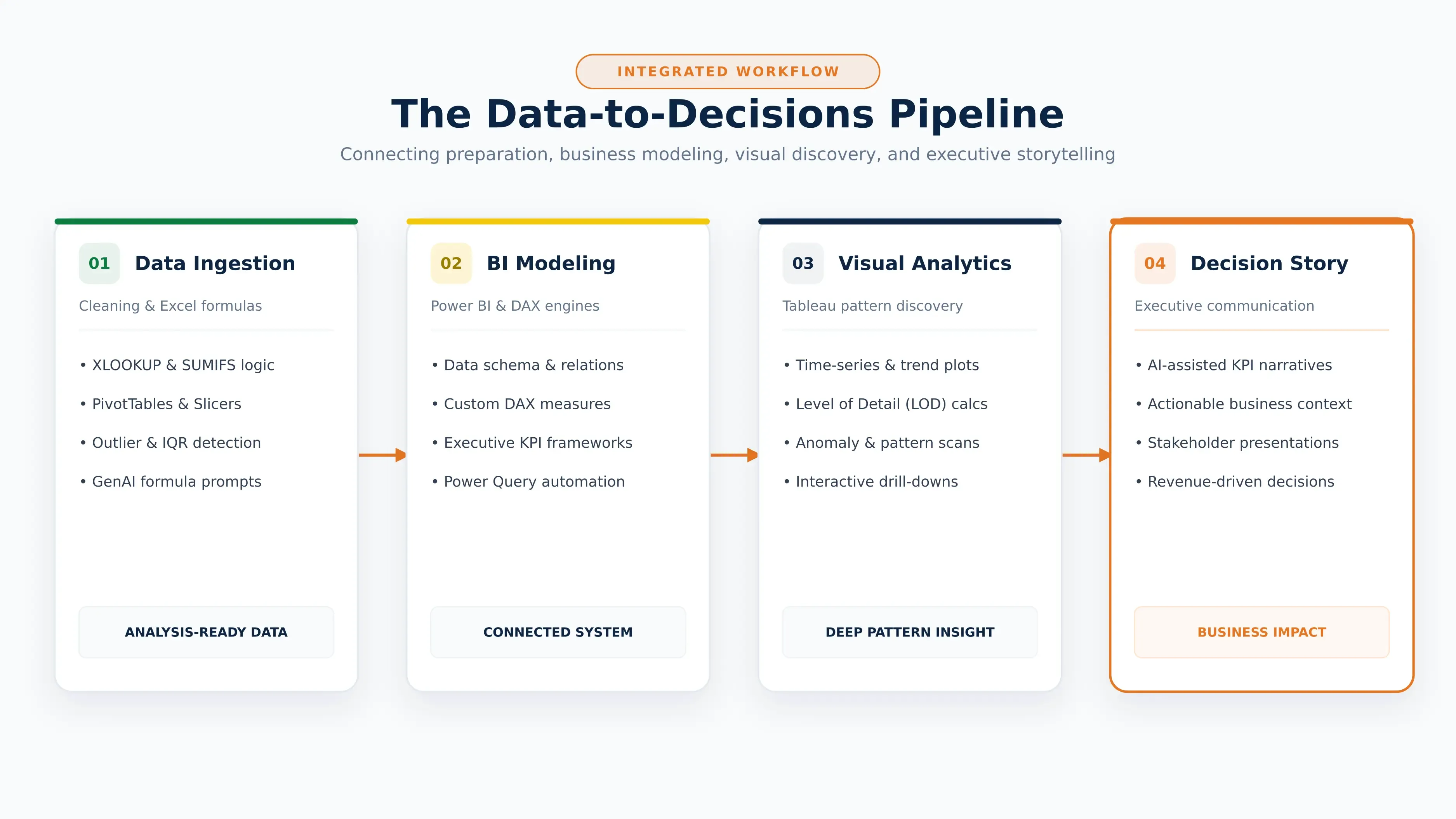
The three tools can be used at different stages of a data analysis process. An analyst might first receive raw sales data in Excel. The data can then be checked, cleaned, and organised before being moved into Power BI for dashboard creation.
Tableau can also be used when the project requires deeper visual exploration or a different reporting approach. The exact workflow depends on the organisation, data sources, reporting requirements, and business questions.
This approach shows why data analytics is broader than learning a single software tool. A student should understand how tools fit into the overall process.
From Dashboards to Data Storytelling
A dashboard can contain many charts and numbers, but that does not automatically make it useful. Data storytelling focuses on explaining what the data means and why it matters.
Suppose a dashboard shows that website traffic increased by 30 percent but sales remained almost unchanged. Instead of simply reporting both numbers, an analyst can investigate the relationship between traffic, conversion rate, customer source, and product pages.
The final report can then explain the key finding and provide context for business teams.
This skill is important for students preparing for data analysis certification courses, because professional data analysts need to communicate findings clearly to people who may not have a technical background.
How AI Is Changing Excel, Power BI and Tableau
AI is changing how analysts work with spreadsheets, dashboards, and visualisation tools. AI features can help users generate formulas, explore datasets, identify patterns, summarise information, and create visual reports more quickly.
However, AI does not remove the need for analytical thinking. An analyst still needs to understand the business problem, check the quality of the data, verify AI generated results, and decide whether an insight is meaningful.
For students, this means learning tools alongside data reasoning is becoming increasingly important. A modern course data science pathway can help learners understand both technical tools and the thinking required to use them responsibly.
Case Study
Consider a retail company that sells products through several stores and an online platform. The company has sales records, customer information, product data, and website activity.
The analyst first uses Excel to review the data, remove errors, and identify basic trends. The cleaned information is then connected to Power BI to create an interactive sales dashboard.
The dashboard shows that online traffic has increased, but conversion rates are lower than expected. The analyst uses further visual analysis to compare customer segments and product categories.
The business discovers that several high traffic product pages have low conversion rates. Instead of simply increasing advertising spend, the company can investigate those product pages and improve pricing, information, or the purchase process.
The important point is that the tools did not make the decision themselves. They helped the analyst move from raw information to a clearer business question and a more informed decision.
Skills Needed for Data Analyst and Business Intelligence Roles
Students preparing for data analyst and business intelligence roles need a combination of technical and practical skills. Learning Excel, Power BI, and Tableau can provide useful tool knowledge, but these skills should be supported by an understanding of data analysis.
Important skills include:
- Excel formulas, pivot tables, data cleaning, and reporting
- Power BI data modelling, dashboards, and business reports
- Tableau visualisation and dashboard development
- Basic statistics and data interpretation
- SQL and database fundamentals
- Data cleaning and preparation
- Problem solving and analytical thinking
- Data storytelling and presentation
- Understanding business requirements
- Using AI tools while checking and validating their output
A structured data analytics courses pathway can help students build these skills progressively instead of learning each tool separately.
Absolutely. I’ll structure the Excel, Power BI and Tableau Applied Program in the same systematic format as the Advanced Java and DSA example, with clearly visible Markdown tables and without adding details that are not present in the source.
Why is the Excel, Power BI and Tableau Applied Program by NIIT a strong choice?
The Excel, Power BI and Tableau Applied Program by NIIT is designed for learners who want to build practical skills in data analysis, business intelligence, data visualization, and business storytelling. The program starts with Excel fundamentals and gradually moves into Power BI and Tableau, helping learners understand how to prepare, analyze, visualize, and communicate data.
The program also brings Generative AI into the analytics workflow. Learners use AI-assisted tools for tasks such as data cleaning, formula generation, DAX creation, dashboard development, visualization selection, KPI narration, and insight generation.
Through hands-on assignments, business case studies, projects, dashboards, and assessments, learners develop analytical thinking and practical skills that can be applied to real-world business reporting and decision-making scenarios.
Program at a Glance
| Program Feature | Details |
|---|---|
| Program Name | Excel, Power BI and Tableau Applied Program |
| Provider | NIIT |
| Duration | 156 Hours |
| Core Focus | Data Analytics, Business Intelligence, Data Visualization, Data Storytelling |
| Primary Tools | Excel, Power BI, Tableau |
| AI Tools | ChatGPT, MS Copilot, Claude, Formula Bot |
| Learning Approach | Hands-on, applied learning, assignments, projects, case studies |
| Methodology | Structured learning roadmap, mentor interactions, AI-assisted learning, performance tracking |
| Projects | Excel Business Data Storytelling & Dashboard, Power BI Executive Business Intelligence Dashboard |
| Case Studies | Sales Data Analysis, Bird Strike Data Analysis |
| Certification | NIIT Professional Certificate |
| Total Fee | ₹29,999 + 18% GST |
What Does the Excel, Power BI and Tableau Applied Program Cover?
The curriculum covers the complete analytics journey, starting with data preparation and analysis in Excel and progressing to interactive Business Intelligence and visualization using Power BI and Tableau.
| Module | Duration | Key Areas |
|---|---|---|
| Data Analytics & Storytelling using Excel | 60 Hours | Excel fundamentals, data preparation, PivotTables, data visualization, statistics, outlier detection, data storytelling, dashboards |
| Advanced Visualization & BI using Power BI | 60 Hours | Advanced data visualization and Business Intelligence using Power BI |
| Data Visualization & Business Intelligence using Tableau, Self-Paced | 36 Hours | Tableau-based data visualization and Business Intelligence |
Module 1: Data Analytics & Storytelling using Excel
Duration: 60 Hours
This module develops the foundation for practical data analysis using Excel. Learners work with data preparation, analysis, statistics, visualization, dashboards, and business storytelling while also learning how GenAI can support different stages of the analytics workflow.
| Area | What Learners Cover |
|---|---|
| Excel Fundamentals & Data Preparation | Understand data categories and types; use XLOOKUP, SUMIFS, COUNTIFS, AVERAGEIFS, and MAXIFS; import data from multiple sources; clean and transform datasets; use GenAI tools for formula generation and data preparation |
| Data Summarization & Pivot Analysis | Organize and summarize data using PivotTables and PivotCharts; apply sorting, filtering, grouping, and slicers; use AI-assisted analytics tools to generate actionable insights |
| Data Visualization | Create bar, column, line, pie, scatter, histogram, and box plot charts; select suitable visualizations for different business scenarios; generate AI-assisted charts and automated visual insights |
| Descriptive Statistics & Data Exploration | Calculate mean, median, and mode; analyze range, IQR, variance, standard deviation, and skewness; measure relationships using Pearson correlation; use GenAI to support statistical summaries and interpretations |
| Outlier Detection & Data Quality | Detect and interpret outliers; apply IQR and z-score-based treatments; improve data quality through AI-assisted validation and preprocessing |
| Data Storytelling & Business Communication | Combine data, visuals, and narratives to communicate insights; conduct KPI-driven analysis; develop business stories; generate AI-assisted narratives and executive summaries |
| Dashboard Design & Reporting | Build interactive Excel dashboards using PivotTables, charts, and slicers; present KPIs and business metrics effectively; create AI-assisted dashboards and decision-ready reports using ChatGPT and other GenAI tools |
Hands-on Activity
Learners complete a two-phase course-end project, demonstrate their learning through a course-end assessment, and present the final project across two sprints. This provides an opportunity to demonstrate end-to-end analytics and business problem-solving skills.
Module 2: Advanced Visualization & BI using Power BI
Duration: 60 Hours
The second module moves from spreadsheet-based analysis to Business Intelligence using Power BI. Learners develop skills required to create interactive dashboards, work with business data, build KPIs, and communicate insights for decision-making.
| Area | Focus |
|---|---|
| Power BI | Advanced visualization and Business Intelligence using Power BI |
| Business Intelligence | Apply analytics concepts to support business reporting and decision-making |
| Interactive Reporting | Develop interactive dashboards and reports |
| Data Visualization | Present business information through meaningful visualizations |
| AI-Assisted Analytics | Use AI-powered capabilities to support dashboard development, narratives, and insight generation |
Module 3: Data Visualization & Business Intelligence using Tableau
Duration: 36 Hours, Self-Paced
The third module introduces Tableau for data visualization and Business Intelligence. It enables learners to work with visual analytics and develop interactive ways of communicating business information.
| Area | Focus |
|---|---|
| Tableau | Data visualization and Business Intelligence |
| Visual Analytics | Explore business data through interactive visualizations |
| Business Intelligence | Use Tableau to support analysis and decision-making |
| Advanced Visual Analytics | Apply time-series, spatial, relational, distribution, trend, correlation, LOD, and table calculation techniques |
| Self-Paced Learning | Complete the Tableau module through a self-paced learning format |
AI-Augmented Analytics Approach
The program integrates Generative AI into different stages of the analytics workflow. AI is used to accelerate tasks while learners are expected to validate AI-generated outputs.
| Analytics Stage | AI-Assisted Application |
|---|---|
| Data Preparation | Data cleaning, validation, preprocessing |
| Formula Development | Formula generation in Excel |
| Analysis | Statistical summaries and insight generation |
| Visualization | Chart generation and visualization selection |
| Power BI | DAX creation and dashboard development |
| Storytelling | KPI narration and executive summaries |
| Reporting | Business narratives and decision-ready reports |
Tools and Technologies
The program provides hands-on exposure to analytics, Business Intelligence, visualization, and AI tools.
| Tool | Application |
|---|---|
| Excel | Data preparation, analysis, visualization, dashboards, and reporting |
| Power BI | Business Intelligence, dashboards, KPIs, and interactive reporting |
| Tableau | Data visualization and Business Intelligence |
| ChatGPT | AI-assisted analytics, narratives, dashboards, and insight generation |
| MS Copilot | AI-assisted productivity and analytics |
| Claude | AI-assisted analytics and productivity |
| Formula Bot | AI-assisted formula generation |
Projects Learners Build
The program includes applied projects and business case studies that help learners connect analytics concepts with practical business scenarios.
| Project / Case Study | What Learners Work On |
|---|---|
| Business Data Storytelling & Dashboard | Analyze real-world datasets using Excel; clean, summarize, visualize, and communicate business insights through interactive dashboards; create a data analysis report, executive presentation, and portfolio-ready solution |
| Executive Business Intelligence Dashboard | Develop interactive BI dashboards using Power BI, Power Query, DAX, and AI-powered capabilities; create KPI frameworks, AI-generated narratives, and executive business presentations |
| Case Study: Sales Data Analysis | Analyze sales distribution, identify patterns and trends, and use Tableau visualizations to evaluate sales performance and support trend-based decision-making, including future product demand and inventory planning |
| Case Study: Bird Strike Data Analysis | Analyze yearly and quarterly bird-strike trends, airline damage costs, and the number of people injured using Tableau; communicate important patterns, trends, and insights |
Business Scenarios Covered
| Project | Example Business Areas |
|---|---|
| Business Data Storytelling & Dashboard | Consumer Analytics, Technology & Innovation Analytics, Social Media Analytics, Transportation & Mobility Analytics, Media & Entertainment Analytics |
| Executive Business Intelligence Dashboard | Sales & Revenue Analytics, Finance Analytics, Marketing Analytics, Customer Experience Analytics, Supply Chain & Logistics Analytics |
| Sales Data Analysis | Retail & Sales Analytics, Sales Analytics, Demand Forecasting, Inventory Planning, Retail Performance Management |
| Bird Strike Data Analysis | Aviation, Aviation Safety, Risk Management, Airline Operations, Cost Analysis, Data Analytics |
Learning Outcomes
By the end of the program, learners develop practical skills across the complete data analytics and Business Intelligence workflow.
| Learning Outcome | Skills Developed |
|---|---|
| Transform Data into Insights | Convert raw, structured, and semi-structured data into actionable business insights using Excel, Power BI, Tableau, and AI-assisted analytics |
| Apply the Analytics Workflow | Prepare, analyze, visualize, communicate, and recommend solutions for business reporting and decision-making challenges |
| Prepare and Transform Data | Use Excel, Power Query, and AI-assisted tools to create analysis-ready datasets |
| Build Power BI Solutions | Create data models, develop DAX calculations, and build meaningful KPIs |
| Create Interactive Dashboards | Develop dashboards, visualizations, and executive-ready reports using Power BI and Tableau |
| Use Generative AI | Apply AI tools to data preparation, visualization, storytelling, and insight generation while validating AI-generated outputs |
| Communicate Findings | Present findings through dashboards, executive presentations, AI-generated narratives, and actionable recommendations |
| Build a Portfolio | Create portfolio-ready Business Intelligence solutions through projects integrating Excel, Power BI, Tableau, AI, and business communication |
| Prepare for Entry-Level Roles | Build practical skills relevant to entry-level Data Analyst and Business Intelligence roles |
| Identify Business Patterns | Detect trends, patterns, anomalies, and key business drivers to support data-driven decisions |
Industry-Recognized Certification
Learners receive an NIIT Professional Certificate after successful completion of the program.
| Certification Benefit | Details |
|---|---|
| Global Recognition | Accepted by leading employers and organizations worldwide |
| Easy Sharing | Can be added to LinkedIn, resumes, and professional portfolios |
| Career Value | Demonstrates practical skills aligned with industry needs |
| Certificate | Certificate of Completion for the Excel, Power BI and Tableau Applied Program |
Data-Driven Learning Methodology
The program follows a structured learning ecosystem designed to provide measurable progress and continuous support.
| Learning Feature | How It Supports Learners |
|---|---|
| Structured Learning Roadmap | LMS-based learning pathway with defined milestones and module progression |
| Learner Connect Sessions | Regular live mentor interactions to resolve doubts, reinforce concepts, and maintain engagement |
| AI-Assisted Faculty Quality Monitoring | AI-assisted faculty performance analysis to support consistent teaching quality |
| Program Performance Report | Tracks attendance, assignments, assessments, quizzes, and overall performance |
| Applied Case Studies | Connect concepts with real-world business scenarios |
| Advanced Visual Analytics | Provides exposure to time-series, spatial, relational, distribution, trend, correlation, LOD, and table calculation techniques |
Career and Portfolio Development
The program focuses on building practical work that learners can use to demonstrate their skills.
| Portfolio Element | What It Demonstrates |
|---|---|
| Excel Business Dashboard | Data preparation, analysis, visualization, and business storytelling |
| Power BI Dashboard | Business Intelligence, KPI development, data modeling, and interactive reporting |
| Tableau Case Studies | Data visualization and business analysis |
| Executive Presentations | Ability to communicate insights to business stakeholders |
| AI-Assisted Workflows | Practical use of AI tools across analytics activities |
| Course-End Projects | End-to-end application of analytics and business problem-solving skills |
The program also encourages learners to showcase professional capstone work on LinkedIn and in their portfolios to demonstrate practical capabilities to recruiters and employers.
Who Can Consider This Program?
| Learner Profile | How the Program Can Help |
|---|---|
| Aspiring Data Analysts | Build practical foundations in Excel, Power BI, Tableau, and analytics |
| Business Intelligence Aspirants | Develop dashboarding, visualization, KPI, and BI skills |
| Excel Users | Move beyond basic spreadsheet usage into advanced analytics and Business Intelligence |
| Working Professionals | Strengthen data-driven reporting and visualization capabilities |
| Learners Interested in Data Visualization | Develop practical skills using Power BI and Tableau |
| Professionals Interested in AI-Assisted Analytics | Learn how GenAI tools can support data preparation, analysis, visualization, and storytelling |
| Career Changers | Develop a structured foundation in analytics and Business Intelligence |
Duration, Batch and Fee
| Program Detail | Information |
|---|---|
| Total Duration | 156 Hours |
| Upcoming Batch 1 | 28 September |
| Batch Type | Weekday |
| Schedule | Monday, Tuesday, Thursday, Friday, 09:00 AM to 11:00 AM |
| Upcoming Batch 2 | 13 October |
| Batch Type | Weekday |
| Schedule | Monday, Tuesday, Thursday, Friday, 07:30 PM to 09:30 PM |
| Custom Schedule | Custom Schedule Assistance available |
| Program Fee | ₹29,999 |
| GST | 18% GST applicable |
Building Data Skills with NIIT Digital
The journey from raw data to business decisions involves much more than completing a regular Power BI course. Excel, Power BI, and Tableau each have an important role, but effective data analysis also requires data preparation, analytical thinking, visualisation, storytelling, and business understanding.
For students looking for structured, practical learning, NIIT Digital can help build skills that go beyond individual software tools. A career focused learning approach can help learners understand how data is handled, analysed, visualised, and communicated in real world situations.
If you want to build practical data analysis and business intelligence skills, explore NIIT Digital's relevant data programs and choose a learning path that matches your career goals.
Ready to move beyond spreadsheets and basic dashboards?
Explore NIIT Digital's data programs and start building practical skills for a data driven career.
Explore the ProgramFrequently Asked Questions
1. Is Power BI enough to become a data analyst?
A: Power BI is an important business intelligence and visualisation tool, but it is only one part of a data analyst's skill set. Analysts may also need Excel, SQL, statistics, data cleaning, communication, and business understanding.
2. Should I learn Excel before Power BI?
A: Learning Excel first can be helpful because it introduces basic data organisation, formulas, pivot tables, and analysis. However, students can also learn Power BI directly if they have a basic understanding of spreadsheets and data.
3. What is the difference between Power BI and Tableau?
A: Both tools support data visualisation and interactive dashboards. Power BI is widely used for business intelligence and reporting, while Tableau is strongly associated with visual data exploration and dashboard development. The right choice depends on the organisation and project requirements.
4. Is a Tableau developer course useful for beginners?
A: It can be useful for students interested in data visualisation and business intelligence. Beginners should ideally choose training that includes practical datasets, dashboard projects, data preparation, and visualisation principles.
5. What should I learn for a data analyst career?
A: A beginner can start with Excel, data analysis concepts, SQL, Power BI or Tableau, basic statistics, data visualisation, and communication. Practical projects can then help connect these skills to real business problems.
NIIT
Expert Contributor
Industry expert contributing to NIIT's knowledge base on technology and education.